Today we're releasing Customizable Dashboards in public beta, and we think you are going to like it.
Dashboards is one of our most requested features, and now you can build a health view around every dataset your team already maintains in Soda. Pick a metric, group it by any dataset or check attribute you use, and compose a board according to your needs.
Here is what is in it.
Slice your data quality results by your own attributes
You already tag datasets and checks in Soda. Data domain. Data product. Data quality dimension. Criticality. Owner.
Now you can visualize them without setting up additional tools.
Health score by data domain. Failed checks by data product. Coverage by criticality tier. Rows tested by data quality dimension.
Attributes live on datasets and on checks, and you can group by either one. A dataset attribute like data domain gives you health per domain. A check attribute like data quality dimension gives you which dimensions fail most.
Use Then by to put two of them in the same tile. Health by domain, split by data quality dimension.
Three default boards, ready on day one
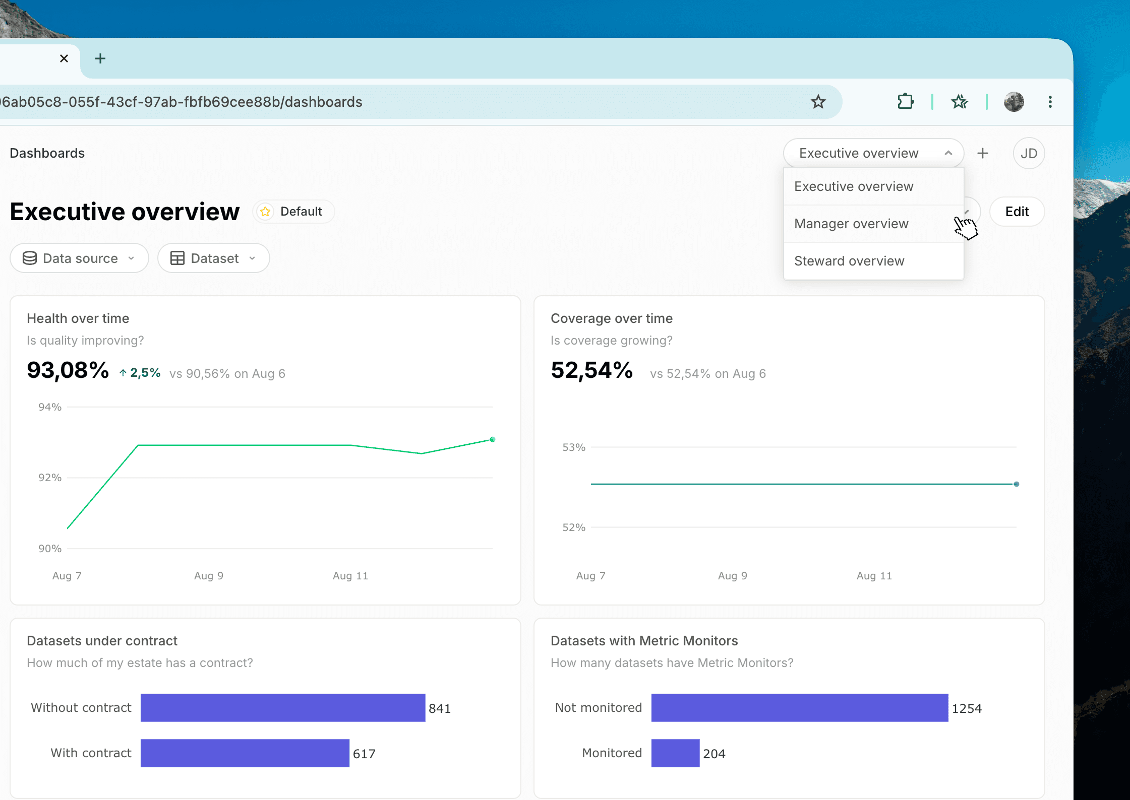
Dashboards ship with three boards, each designed for what a different role cares about.
Executive overview. Designed to answer whether quality is improving, whether coverage is growing, and how much of your data has a contract.
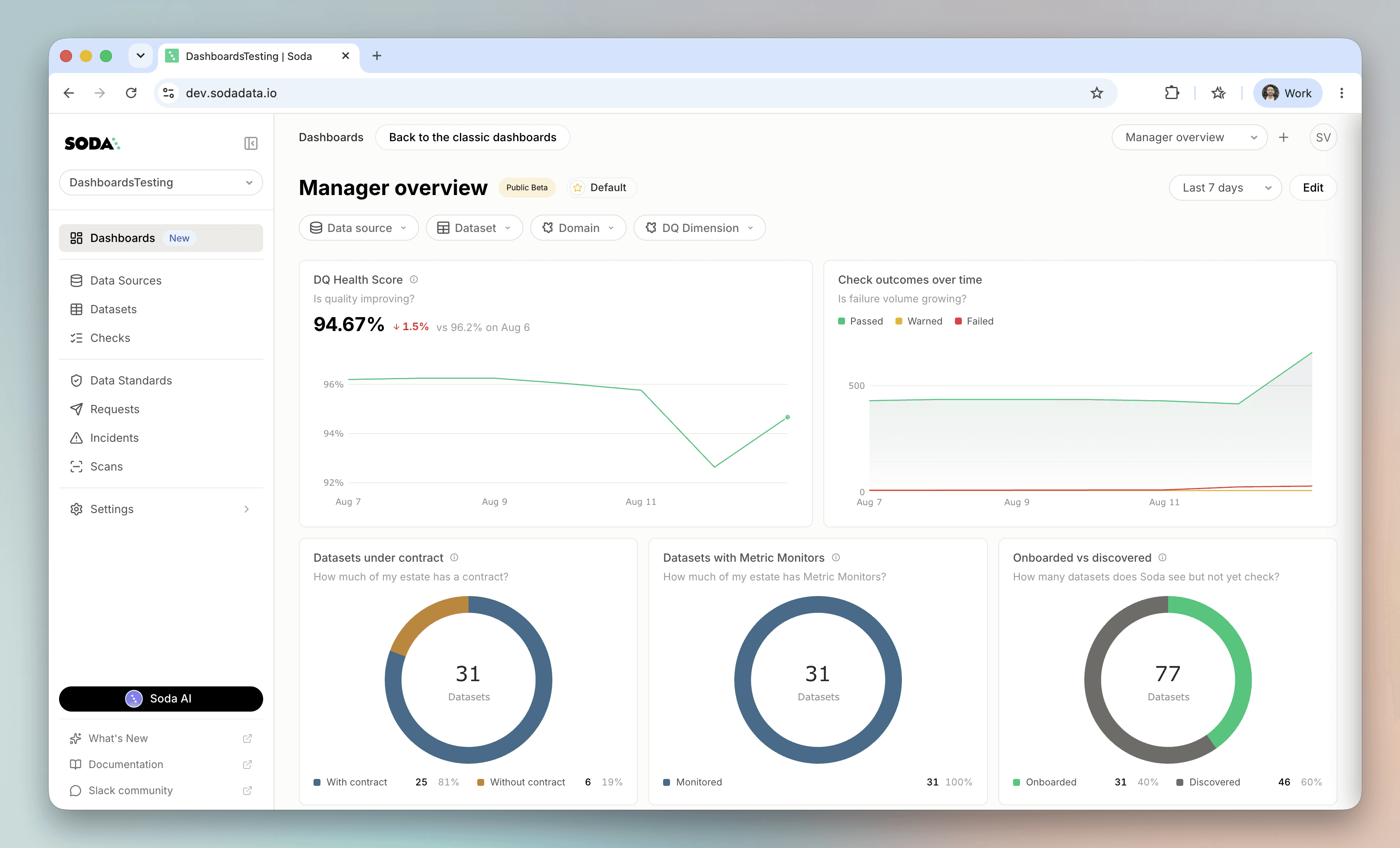
Manager overview. Designed to show the state of your data quality program and where to push it next: check outcomes and anomalies over time, what's onboarded and what isn't, health per dataset.
Steward overview. Designed for what to fix today: which datasets have failing checks, how many rows passed and failed in each, where anomalies are firing.
Start from the one closest to your job and customize it until it shows what you care about.
Ten metrics you can plot
Every tile starts with a metric. These are the ten to pick from.
Three of them answer the question leadership actually asks. The Health Score says whether quality is improving, Coverage says whether the program is reaching more of your data, and Contracts says how much of it has an agreement behind it.
The other seven are for the people doing the data quality work: Checks and Rows tested for what ran, Monitors and Anomalies for what's watching and what it flagged, and Datasets, Data sources and Scans for the shape of your footprint.
Group any of them by data source, schema, dataset, check type, check source, outcome, monitor type, onboarding status, or by whether a dataset has a contract or a monitor. Or by any of your own dataset and check attributes: domain, data product, owner, data quality dimension, and the rest.
Four visualization types
Once you've picked a metric, pick how it looks. Each tile type is good at a different job.
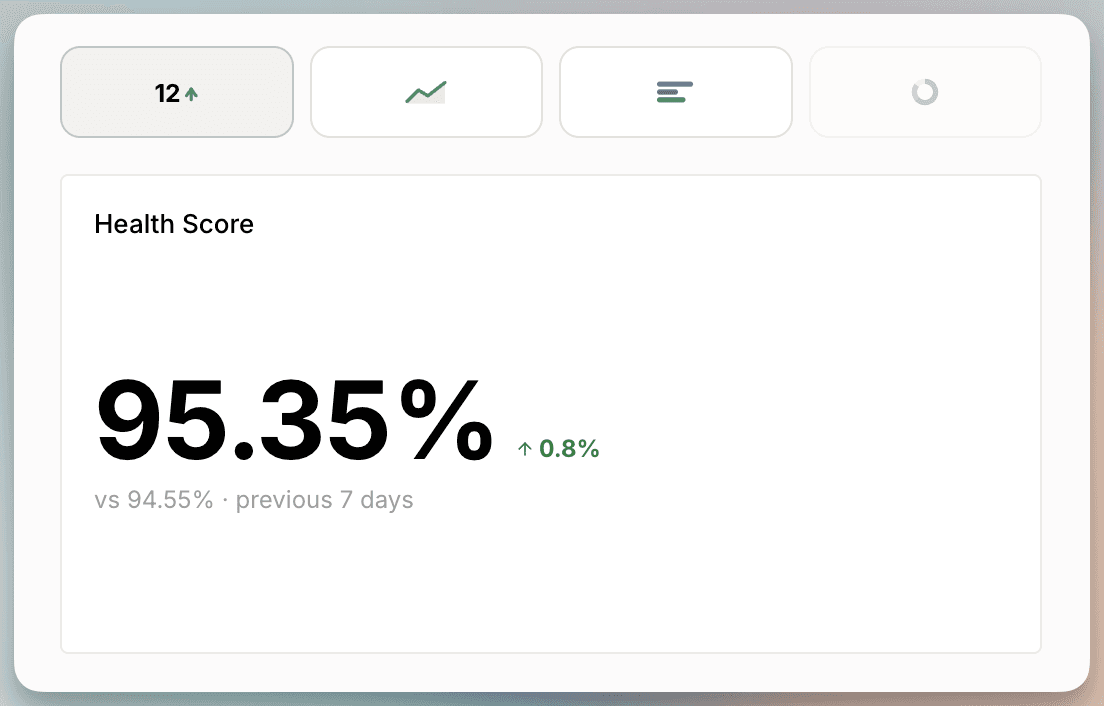
Number
One figure, with its change against the previous period. Put your health score or your open anomaly count at the top of a board and read it in a second.
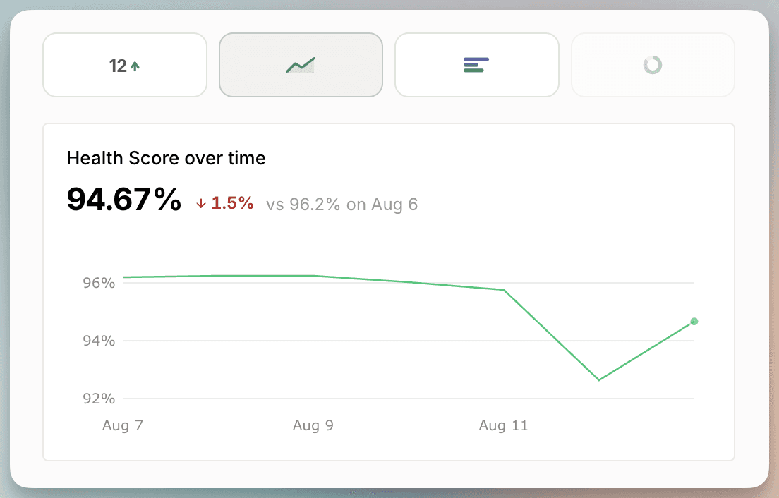
Line
A metric over time. Set the range to the last 7, 30, or 90 days.
Add a breakdown and you get one line per group, so you can see which domains are improving and which are sliding.
Bar
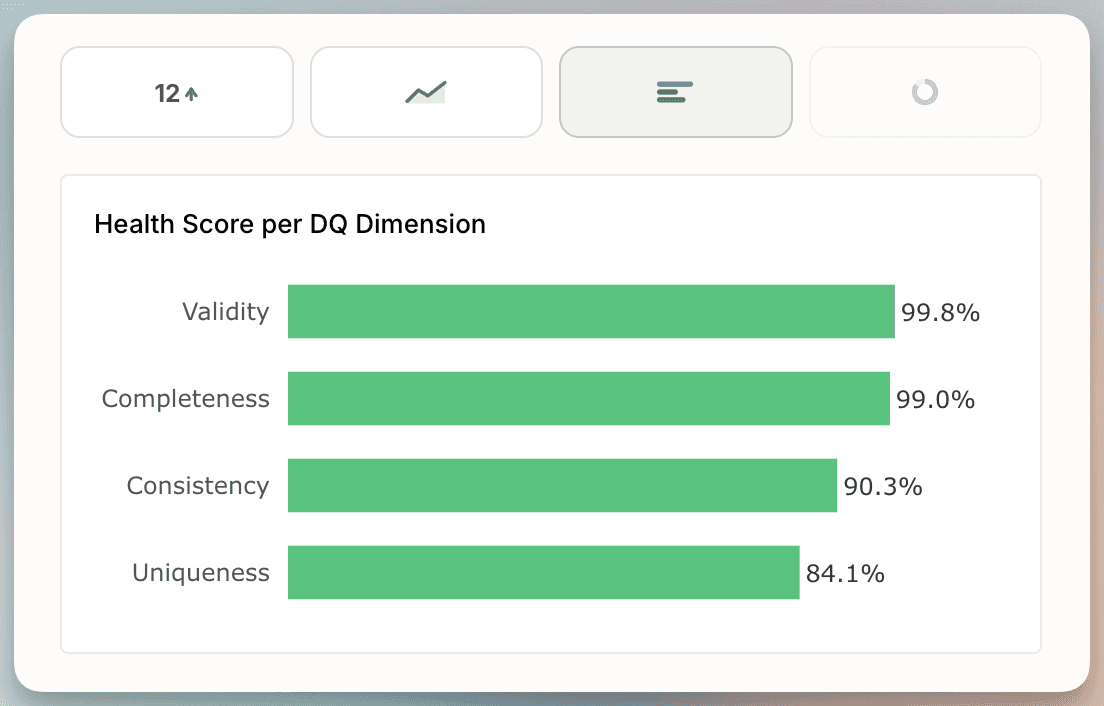
Compare groups against each other. Horizontal or vertical, grouped or stacked.
Stack by outcome to see passed, warned, and failed inside each bar. Sort worst first to put the problem at the top.
Donut
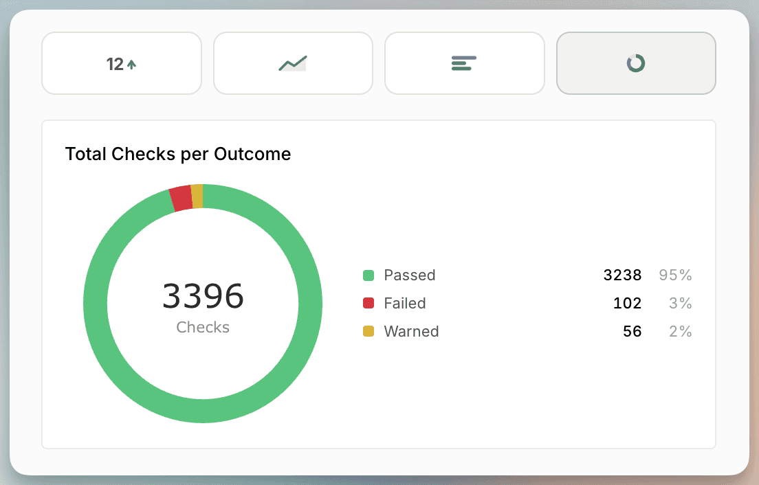
A share of a whole. Datasets with and without a contract. Checks by outcome. Rows that passed against rows that failed.
The preview updates as you pick, so you see the tile before you add it.
Customize the filters
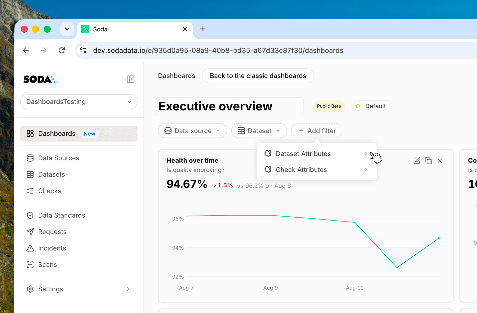
Every board has a filter bar, and you decide what goes in it.
Add a filter for a data source, a dataset, or any of your attributes. Pick a value and every tile on the board updates at once.
Set up a board filtered to a single domain and hand it to the team that owns it.
Duplicate, edit, rearrange
Duplicate a whole view and change what you need instead of starting over.
Duplicate a single tile and swap one dimension. Rename a tile inline. Drag it somewhere else, resize it, or delete it.
Every board saves per view, so the layout you build is the one you come back to.
Build the board your leadership keeps asking for
Open Dashboards in Soda Cloud and build one view: the metric your leadership asks about most, grouped by the attribute your organization runs on. Share it with the team that owns those numbers and see where the conversation goes.
Customizable Dashboards is in public beta, so tell us what's missing. The metric you looked for and didn't find is the most useful thing you can send us.
Join Soda community in Slack or book a demo.