How to Build a Data Observability Dashboard in 5 Steps
How to Build a Data Observability Dashboard in 5 Steps
How to Build a Data Observability Dashboard in 5 Steps

Fabiana Ferraz
Fabiana Ferraz
Technical Writer at Soda
Technical Writer at Soda
Table of Contents
Let us paint a picture: an analyst files a ticket, a business partner pings your Slack, a dashboard silently serves last week's numbers. By the time the complaint reaches you, the bad data has already done its damage.
If your pipelines are failing your stakeholders, and they're finding out data issues before you do, the fix isn't more pipeline runs or more manual spot-checks. It's a data observability dashboard: a single view of pipeline health, data quality metrics, and active incidents that lets your team detect, triage, and resolve issues before anyone downstream notices.
Over five steps, you'll go from no centralized monitoring to an operational data observability dashboard that watches your most critical pipelines around the clock and routes the right information to the right people when something breaks.
But before you start: this guide assumes your working familiarity with data observability concepts. If you're new to the topic, read our guide to the five pillars of data observability first.
What Is a Data Observability Dashboard?
A data observability dashboard is a monitoring interface built on the five pillars of data observability. It tracks freshness, volume, distribution, and schema over time, while using lineage as the connective tissue to put them in context—pointing to the upstream asset behind a problem and the downstream report at risk.
It exists to answer three operational questions at a glance:
Is data arriving on time?
Does it look the way it should?
And if something broke, where did it break?
Pinpointing the “where” fast is what lets you get to the “why” while the incident is still small. A data observability dashboard is your first line of defense, watching metrics over time and using anomaly detection to flag when something looks off.
Data observability’s focus on the system's own health is what sets it apart from other common dashboards:
A BI dashboard reports business metrics (revenue, conversion, active users) to show stakeholders how the business is performing.
A data quality dashboard tracks data reliability across dimensions like accuracy, validity, and completeness. You cannot use anomaly detection to know if a customer's address is valid; you have to explicitly test it against a rule.
A data observability dashboard traffics in trends and anomalies—like noticing a table that normally refreshes by 2 a.m. arriving hours late, or row counts dropping by 20%. It watches the general "vital signs" of your infrastructure for the data team, surfacing problems before they reach the numbers your stakeholders see.
Building a Data Observability Dashboard
In the five steps below, we’ll see how to define your scope, choose the right signals, connect your sources, configure smart alerts, and build an incident workflow. That's the arc from no monitoring to an operational observability layer.
Step 1: Define Your Monitoring Scope
The build starts with scope, not software: decide what actually needs to be monitored before you set anything up. Attempting to observe everything at once is how teams end up with dashboards full of noise that nobody trusts.
Prioritize by downstream impact. Start with the data assets that feed customer-facing products, executive reporting, or regulated outputs. These are the highest-cost failure points; the pipelines where a problem at 9 am becomes a call from the CFO by noon.
Map the critical path. Trace the flow from raw source data through transformations to final consumption tables. Every node in that path, every staging table, every dbt model, every API ingest is a candidate for monitoring. You don't need to watch all of them on day one, but you need to understand the full chain before you can make informed triage decisions later.
Define failure modes per asset. For each prioritized dataset, ask: what does bad data look like here? Common patterns include late arrival, unexpected row count drops, schema drift from an upstream producer, or a null rate spike in a column that's never null in healthy conditions. Defining these failure modes now shapes the checks you'll configure in Step 2.
The output from this step should be a short prioritized list, ideally no more than five to ten assets to start with, with a named owner for each. Scope is the discipline that makes observability sustainable.
Step 2: Choose Your Key Metrics and Signals
With your critical assets identified, map each of the five observability pillars to a measurable signal.
Pillar | What to measure |
|---|---|
Freshness | Time since the last successful update, against its expected cadence |
Volume | Row or record counts per run, against a rolling baseline |
Distribution | Null rates, value ranges, and summary stats (mean, standard deviation, quartiles) of key columns |
Schema | Column adds and drops, type changes, and renames from upstream producers |
Lineage | Which upstream tables feed each asset, so you know where to look first when something breaks |
Here's what each signal watches for, and why it earns a place on the dashboard:
Freshness measures the time since the last successful update. For each dataset, set a threshold based on its expected refresh cadence plus the downstream SLA it has to meet—for example, an hourly table might alert if it hasn't been refreshed within 90 minutes, leaving headroom before a late load breaks a 9 a.m. report. Stale data is one of the quietest failures; it doesn't break anything visibly, it just serves the wrong answer.
Volume is the row count or record count per pipeline run. For example, significant drops or unexpected spikes relative to a rolling baseline are reliable early signals of upstream problems, a source system going silent, a filter applying when it shouldn't, or a join that started behaving unexpectedly.
Distribution monitors the statistical profile of key columns, including null rates, value distributions, and range boundaries. When a column that's always 95% populated starts coming in at 40% null, something upstream changes. Distribution drift is often the first signal of a schema or logic change that nobody documented.
Schema observes column additions, deletions, type changes, and renames. Schema changes from upstream producers are one of the most common root causes of downstream pipeline failures and one of the most preventable with the right monitoring in place.
Lineage tracks which upstream tables and sources feed each monitored asset. Lineage doesn't generate alerts on its own, but it's what gives alerts context. When a volume check fires, lineage tells you where to look first.
Match Signals with Detection Methods
The five signals tell you what to watch. The next decision is how to watch each one: match the detection method to what you already know about the failure. Getting this match right is what keeps a dashboard from drowning in false positives.
What you know about the failure | Detection method |
|---|---|
The metric and its acceptable range are both known | Enforce it with a test or assertion |
The metric matters, but the failure mode is unknown | Anomaly detection on that metric, against a learned baseline |
You don't know which column or metric will break | Multivariate drift detection across the whole dataset |
You just need broad, cheap coverage across many tables | Metadata-level signals: row count, schema, freshness |
That table also doubles as a rollout order: layer coverage from cheap and broad to precise and narrow. Broad metadata signals first, then drift detection, then targeted metric monitoring, and finally enforced tests for the failure modes you can name.
Start with observability for breadth and speed; rely on tests for the guarantees that matter. Broad signals catch the obvious breakages on day one, and you promote a watch to an enforced test once a specific failure is worth pinning down.
Some important notes:
Don't track everything. A dashboard with 200 metrics that nobody reviews is worse than no dashboard. Five well-chosen signals per critical dataset is a stronger starting point than exhaustive coverage of lower-priority assets.
Mind the cost gradient when you pick signals. Metadata-based monitors (row count, schema changes, last-modified time) read warehouse metadata without scanning rows, so they're cheap enough to blanket thousands of tables. Partition-query and column-level monitors run real scans, so reserve them for datasets where that depth earns its compute, and trigger their one-time historical backfill scan in a single pass so every monitor shares one look-back window.
Watch your partition windows. Partition-based monitors evaluate the most recent partition, so a record written today but stamped with an older timestamp lands in a closed partition and isn't re-evaluated. If you regularly backfill or ingest late-arriving data into historical partitions, pair these signals with a reconciliation check on the affected window.
Step 3: Connect Your Data Sources and Pipeline Tools
With your metrics defined, wire your observability tooling into the data sources and pipeline infrastructure identified in Step 1. Most modern observability platforms support native integrations with cloud warehouses: Snowflake, BigQuery, Databricks, Redshift, and orchestrators like Airflow, dbt, and Prefect.
Here is how to wire this up using Soda as your observability layer.
Soda Data Observability Dashboard
The Soda Cloud dashboard is the operational observability layer with metric monitoring and adaptive anomaly detection, live out of the box once connected. No custom infrastructure to build.
As soon as a data source is connected, the metric monitoring dashboard becomes available. Soda establishes a statistical baseline for each metric and continuously compares new scan results against it, flagging anomalies according to the sensitivity, exclusions, and threshold strategy you configure.
How much history you get on day one depends on your warehouse: metadata-based monitors (row count, schema, last modification) backfill immediately only where the source exposes metadata history (BigQuery, Databricks, and Redshift), while on Snowflake and similar sources, they build their baseline forward from the first scan. Data and column monitors backfill either way, through a one-time historical scan against your partitioned data.
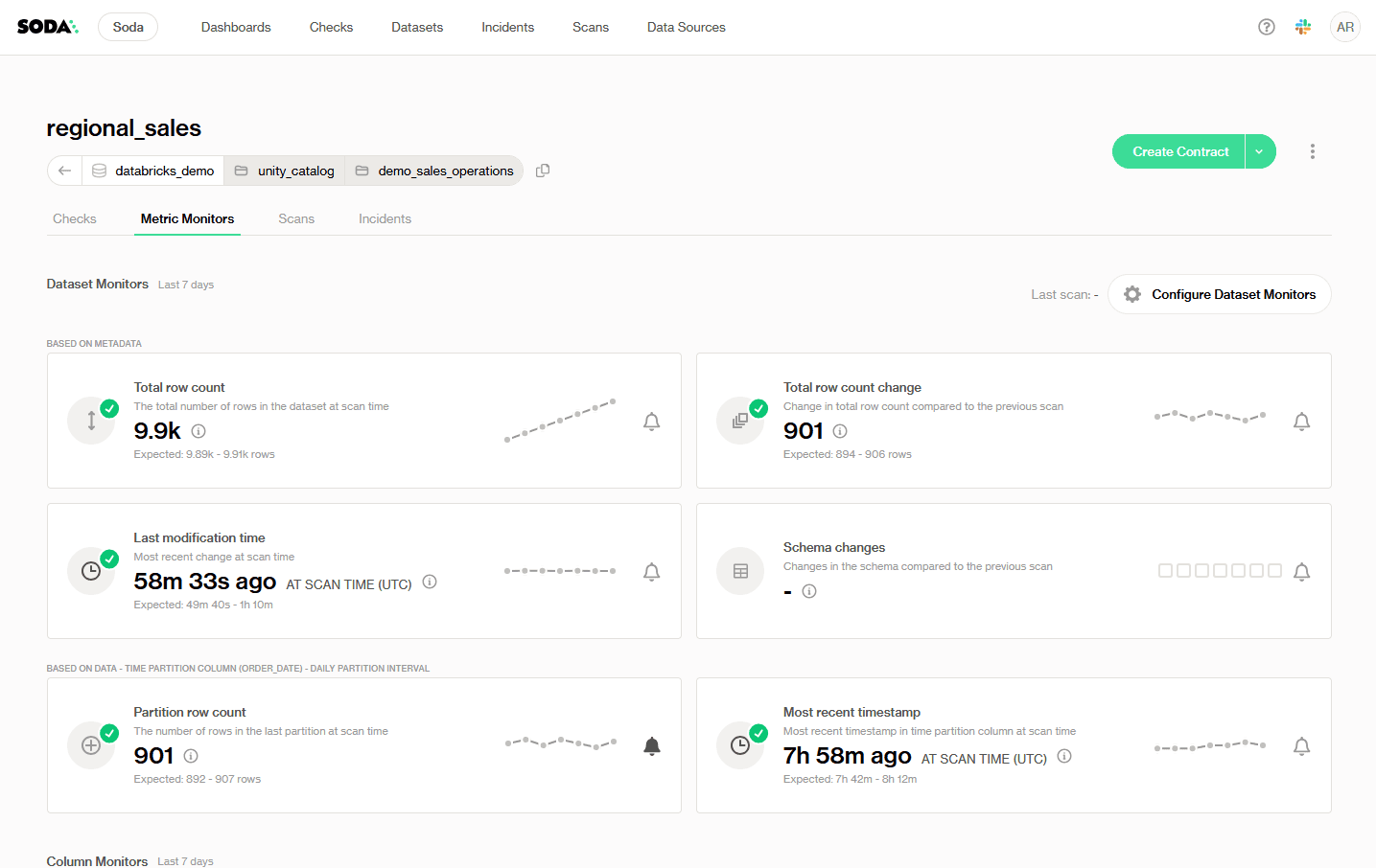
↗ Soda Cloud Metric Monitors dashboard, dataset monitors for the regional_sales table, showing row count, modification time, schema changes, and partition metrics.
Understanding Metric Monitors in Soda
Metric monitors are the foundation of data observability in Soda. Monitors track data quality metrics over time and leverage historical values for analysis. Soda automatically collects these metrics and examines how they evolve over time through a proprietary anomaly detection algorithm to identify when metrics deviate from expected patterns and trigger alerts. These deviations are surfaced and recorded in the metric monitors tab for each dataset.
Monitors vs. metrics: the main difference is that monitors are configurable, while metrics are not. Monitors build on top of metrics by wrapping their static measurement in a configurable context. The user can select scan time, scan frequency, thresholds, and the metric to use. Metrics are built-in, static definitions of data properties. You can't alter how a metric is computed at its source, but you can select which metric to track through a metric monitor.
Types of Monitors
Dataset monitors provide instant, no-setup monitoring based on metadata. They track high-level metrics like row count changes, schema updates, and insert activity, ideal for catching structural or pipeline-level issues across large numbers of datasets. Dataset monitors apply to the entire table (or its latest partition) and work out of the box when the necessary data and metadata are available.
Soda supports two categories of dataset-level monitors: metadata-based monitors (total row count, row count change, last modification time, schema changes) and time-partition-based monitors (partition row count, most recent timestamp).
Column monitors are more granular and customizable. They focus on specific fields, allowing you to track things like missing values, averages, or freshness, useful for capturing data issues that impact accuracy or business logic at the column level.
For column monitors to work, a time partition column must be defined—a date or timestamp field that reflects when records arrive in the table, not when they were created upstream.
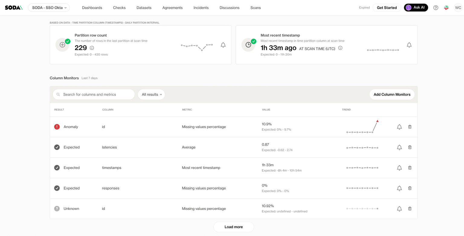
↗ Soda column monitors list flagging an anomaly on the id column, while other columns read as expected.
Each row in the column monitors list shows the anomaly detection result (Anomaly, Expected, or Unknown), the column name, the metric being tracked, the latest value, and a trend sparkline. It is recommended to add column monitors only to columns where changes are likely to reflect actual data quality issues; adding too many can create false positives and noise.
Reporting Beyond The Data Team
Connect Soda Cloud to Sigma to build live reporting dashboards on top of your data quality results. You can create dashboards that visualize Soda check results, track failed rows over time, and report on the overall health of your data assets.
Once Sigma is connected to Soda or a Soda data source such as a Diagnostics Warehouse, you can build and share dashboards without any additional export or scripting steps. For programmatic access, the Soda Cloud API lets you extract checks and dataset results and write them to a data warehouse of your choice, which Sigma can then query.
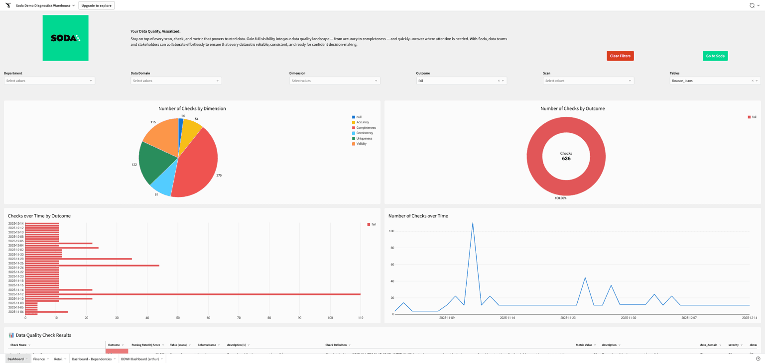
↗ A Sigma dashboard built on top of Soda's Diagnostics Warehouse
Lineage capture matters at this stage. Whether through your orchestrator's metadata, dbt's built-in lineage, or a dedicated catalog integration, lineage data should flow into the dashboard alongside your metrics. Without it, alerts fire without context and triage takes significantly longer.
Soda connects to your stack in minutes, no heavy setup required. See how we natively integrate with the orchestrators, warehouses, and catalogs your team already uses. Explore our integrations.
Step 4: Configure Alerts and Thresholds
Your sources are connected and the monitors are running, but so far the dashboard is passive: someone has to be watching it for it to matter. With well-configured alerts, it watches itself.
Start with anomaly detection, not fixed thresholds. Soda's metric monitors establish a statistical baseline per dataset from historical scan data and continuously compare new results against it. This is the right default for most signals, because it adapts to the natural behavior of your data, including seasonal patterns, weekly volume cycles, and gradual growth rather than firing on variance that's actually normal. For most teams, this no-code configuration is enough to get meaningful, low-noise alerting from day one.
Set up scan timing. Schedule scans to run after your load reliably completes, not while it's still writing. A scan that fires mid-load reads incomplete data and flags false anomalies. Pick a consistent daily scan time with a buffer for late loads, and keep it consistent: scanning at the same time every day is what lets the baseline learn what "normal" looks like.
Refine with no-code controls where needed. For signals with well-understood bounds, use valid range (MIN/MAX) constraints to tighten the alert boundary. Adjust your threshold strategy to focus alerting on the direction that matters, upper-bound only for a column that should never exceed a certain value, lower-bound only for a metric that should never drop below a floor. Use exclusion values to filter out known anomalies that don't reflect real data quality issues.
Reserve static thresholds for predictable signals. For tables where behavior is highly consistent and well-understood — a reconciliation table that always lands with between 10,000 and 12,000 rows after each run, for example — static thresholds are a reasonable choice. But they're the exception, not the default.
Route alerts to the right place. Slack channels, PagerDuty, or email depending on severity. Define a severity framework so on-call engineers know how to respond: P1 for customer-facing failures, P2 for internal reporting issues, P3 for non-urgent drift.
Tune aggressively in the first two weeks. Alert fatigue is an observability program killer. A dashboard that fires 30 false positives a day trains the team to ignore it. After launch, review alert history daily and adjust sensitivity and exclusions until every alert gets acted on.
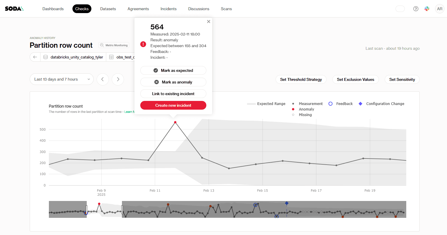
↗ Soda Cloud anomaly history for a partition row-count monitor: a measured value of 564 falls outside the learned expected range of 155–304 and is flagged as an anomaly, with controls to set threshold strategy, exclusion values, and sensitivity.
Step 5: Build an Incident Response Workflow
Your alerts are firing and landing in the right channels. What's still missing is what happens after one goes off. A dashboard answers "what broke." An incident response workflow answers "what do we do about it."
Define a triage process. When an alert fires, who investigates first? A well-designed alert surfaces the dataset name, the check that failed, the expected value, and the actual value; enough context for the on-call engineer to assess severity without digging through logs first.
Use lineage to scope the blast radius. Before escalating, use the lineage view on the dashboard to identify which downstream tables, reports, and models are affected by the failing asset. This determines whether you're dealing with a localized issue or a cascading failure that needs broader coordination.
Document resolution playbooks for common failure types. Stale data: check orchestrator logs for job failures. Volume drop: check the source system for ingestion gaps. Schema change: identify the upstream producer and coordinate a fix. Playbooks reduce mean time to resolution significantly, especially for engineers on first rotation.
Close the feedback loop. Log resolved incidents with root cause and resolution time. Review monthly. This data justifies continued investment in the observability program and reveals systemic issues that individual alerts miss.
Start Right, Shift Left: From Monitoring to Testing
While a dashboard is your first line of defense, it is only one half of a complete data reliability strategy. The other half is testing.
When the same failure mode keeps firing on the same asset, that's the signal to stop watching it and start guaranteeing it.
Monitoring vs. Testing
A monitor watches a metric over time and uses anomaly detection to flag when something looks off, but an anomaly is only a signal, and a signal can be a false alarm. A test enforces an explicit rule, so a failed test is a confirmed problem.
Observability buys you speed and broad coverage; it’s how you catch the unknown. Testing buys you precision and prevention; it’s how you lock down a failure you can now name.
Learn more in our article Data Observability vs Data Testing: What's the Difference?
Promote Recurring Failures to Data Contracts
In Soda, that promotion is a few lines of Soda contract language: the freshness signal you were monitoring and the row range you kept reconciling become a gate that fails the moment either drifts.
Example Soda Data Contract:
dataset: warehouse/prod/analytics/daily_reconciliation

checks:
  # The freshness signal you were watching, now enforced
  - freshness:
      column: loaded_at
      threshold:
        unit: minute
        must_be_less_than: 90
  # A reconciliation table should always land in a known range
  - row_count:
      threshold:
        must_be_between:
          greater_than: 10000
          less_than: 12000
Recurring failures also feed into the broader governance program. If the same pipeline breaks regularly, that's not an alerting problem; it's an ownership and accountability problem. Incident logs are the evidence base that makes those conversations productive.
This is the natural bridge from observability to prevention: broad monitoring surfaces what you didn't know to look for, and enforced tests stop the failures you've already seen from reaching production again.
Go deeper into contracts in our Definitive Guide to Data Contracts.
Wrapping Up
The most important mindset shift here is that a data observability dashboard is not a project you finish; it's a capability you build and refine continuously. Start narrow. Prove value on your three to five most critical pipelines. Expand from there as the team develops confidence in the signals and the response process matures.
Book a demo to see how Soda fits your stack, or review the docs to get started today.
Frequently Asked Questions
Let us paint a picture: an analyst files a ticket, a business partner pings your Slack, a dashboard silently serves last week's numbers. By the time the complaint reaches you, the bad data has already done its damage.
If your pipelines are failing your stakeholders, and they're finding out data issues before you do, the fix isn't more pipeline runs or more manual spot-checks. It's a data observability dashboard: a single view of pipeline health, data quality metrics, and active incidents that lets your team detect, triage, and resolve issues before anyone downstream notices.
Over five steps, you'll go from no centralized monitoring to an operational data observability dashboard that watches your most critical pipelines around the clock and routes the right information to the right people when something breaks.
But before you start: this guide assumes your working familiarity with data observability concepts. If you're new to the topic, read our guide to the five pillars of data observability first.
What Is a Data Observability Dashboard?
A data observability dashboard is a monitoring interface built on the five pillars of data observability. It tracks freshness, volume, distribution, and schema over time, while using lineage as the connective tissue to put them in context—pointing to the upstream asset behind a problem and the downstream report at risk.
It exists to answer three operational questions at a glance:
Is data arriving on time?
Does it look the way it should?
And if something broke, where did it break?
Pinpointing the “where” fast is what lets you get to the “why” while the incident is still small. A data observability dashboard is your first line of defense, watching metrics over time and using anomaly detection to flag when something looks off.
Data observability’s focus on the system's own health is what sets it apart from other common dashboards:
A BI dashboard reports business metrics (revenue, conversion, active users) to show stakeholders how the business is performing.
A data quality dashboard tracks data reliability across dimensions like accuracy, validity, and completeness. You cannot use anomaly detection to know if a customer's address is valid; you have to explicitly test it against a rule.
A data observability dashboard traffics in trends and anomalies—like noticing a table that normally refreshes by 2 a.m. arriving hours late, or row counts dropping by 20%. It watches the general "vital signs" of your infrastructure for the data team, surfacing problems before they reach the numbers your stakeholders see.
Building a Data Observability Dashboard
In the five steps below, we’ll see how to define your scope, choose the right signals, connect your sources, configure smart alerts, and build an incident workflow. That's the arc from no monitoring to an operational observability layer.
Step 1: Define Your Monitoring Scope
The build starts with scope, not software: decide what actually needs to be monitored before you set anything up. Attempting to observe everything at once is how teams end up with dashboards full of noise that nobody trusts.
Prioritize by downstream impact. Start with the data assets that feed customer-facing products, executive reporting, or regulated outputs. These are the highest-cost failure points; the pipelines where a problem at 9 am becomes a call from the CFO by noon.
Map the critical path. Trace the flow from raw source data through transformations to final consumption tables. Every node in that path, every staging table, every dbt model, every API ingest is a candidate for monitoring. You don't need to watch all of them on day one, but you need to understand the full chain before you can make informed triage decisions later.
Define failure modes per asset. For each prioritized dataset, ask: what does bad data look like here? Common patterns include late arrival, unexpected row count drops, schema drift from an upstream producer, or a null rate spike in a column that's never null in healthy conditions. Defining these failure modes now shapes the checks you'll configure in Step 2.
The output from this step should be a short prioritized list, ideally no more than five to ten assets to start with, with a named owner for each. Scope is the discipline that makes observability sustainable.
Step 2: Choose Your Key Metrics and Signals
With your critical assets identified, map each of the five observability pillars to a measurable signal.
Pillar | What to measure |
|---|---|
Freshness | Time since the last successful update, against its expected cadence |
Volume | Row or record counts per run, against a rolling baseline |
Distribution | Null rates, value ranges, and summary stats (mean, standard deviation, quartiles) of key columns |
Schema | Column adds and drops, type changes, and renames from upstream producers |
Lineage | Which upstream tables feed each asset, so you know where to look first when something breaks |
Here's what each signal watches for, and why it earns a place on the dashboard:
Freshness measures the time since the last successful update. For each dataset, set a threshold based on its expected refresh cadence plus the downstream SLA it has to meet—for example, an hourly table might alert if it hasn't been refreshed within 90 minutes, leaving headroom before a late load breaks a 9 a.m. report. Stale data is one of the quietest failures; it doesn't break anything visibly, it just serves the wrong answer.
Volume is the row count or record count per pipeline run. For example, significant drops or unexpected spikes relative to a rolling baseline are reliable early signals of upstream problems, a source system going silent, a filter applying when it shouldn't, or a join that started behaving unexpectedly.
Distribution monitors the statistical profile of key columns, including null rates, value distributions, and range boundaries. When a column that's always 95% populated starts coming in at 40% null, something upstream changes. Distribution drift is often the first signal of a schema or logic change that nobody documented.
Schema observes column additions, deletions, type changes, and renames. Schema changes from upstream producers are one of the most common root causes of downstream pipeline failures and one of the most preventable with the right monitoring in place.
Lineage tracks which upstream tables and sources feed each monitored asset. Lineage doesn't generate alerts on its own, but it's what gives alerts context. When a volume check fires, lineage tells you where to look first.
Match Signals with Detection Methods
The five signals tell you what to watch. The next decision is how to watch each one: match the detection method to what you already know about the failure. Getting this match right is what keeps a dashboard from drowning in false positives.
What you know about the failure | Detection method |
|---|---|
The metric and its acceptable range are both known | Enforce it with a test or assertion |
The metric matters, but the failure mode is unknown | Anomaly detection on that metric, against a learned baseline |
You don't know which column or metric will break | Multivariate drift detection across the whole dataset |
You just need broad, cheap coverage across many tables | Metadata-level signals: row count, schema, freshness |
That table also doubles as a rollout order: layer coverage from cheap and broad to precise and narrow. Broad metadata signals first, then drift detection, then targeted metric monitoring, and finally enforced tests for the failure modes you can name.
Start with observability for breadth and speed; rely on tests for the guarantees that matter. Broad signals catch the obvious breakages on day one, and you promote a watch to an enforced test once a specific failure is worth pinning down.
Some important notes:
Don't track everything. A dashboard with 200 metrics that nobody reviews is worse than no dashboard. Five well-chosen signals per critical dataset is a stronger starting point than exhaustive coverage of lower-priority assets.
Mind the cost gradient when you pick signals. Metadata-based monitors (row count, schema changes, last-modified time) read warehouse metadata without scanning rows, so they're cheap enough to blanket thousands of tables. Partition-query and column-level monitors run real scans, so reserve them for datasets where that depth earns its compute, and trigger their one-time historical backfill scan in a single pass so every monitor shares one look-back window.
Watch your partition windows. Partition-based monitors evaluate the most recent partition, so a record written today but stamped with an older timestamp lands in a closed partition and isn't re-evaluated. If you regularly backfill or ingest late-arriving data into historical partitions, pair these signals with a reconciliation check on the affected window.
Step 3: Connect Your Data Sources and Pipeline Tools
With your metrics defined, wire your observability tooling into the data sources and pipeline infrastructure identified in Step 1. Most modern observability platforms support native integrations with cloud warehouses: Snowflake, BigQuery, Databricks, Redshift, and orchestrators like Airflow, dbt, and Prefect.
Here is how to wire this up using Soda as your observability layer.
Soda Data Observability Dashboard
The Soda Cloud dashboard is the operational observability layer with metric monitoring and adaptive anomaly detection, live out of the box once connected. No custom infrastructure to build.
As soon as a data source is connected, the metric monitoring dashboard becomes available. Soda establishes a statistical baseline for each metric and continuously compares new scan results against it, flagging anomalies according to the sensitivity, exclusions, and threshold strategy you configure.
How much history you get on day one depends on your warehouse: metadata-based monitors (row count, schema, last modification) backfill immediately only where the source exposes metadata history (BigQuery, Databricks, and Redshift), while on Snowflake and similar sources, they build their baseline forward from the first scan. Data and column monitors backfill either way, through a one-time historical scan against your partitioned data.
↗ Soda Cloud Metric Monitors dashboard, dataset monitors for the regional_sales table, showing row count, modification time, schema changes, and partition metrics.
Understanding Metric Monitors in Soda
Metric monitors are the foundation of data observability in Soda. Monitors track data quality metrics over time and leverage historical values for analysis. Soda automatically collects these metrics and examines how they evolve over time through a proprietary anomaly detection algorithm to identify when metrics deviate from expected patterns and trigger alerts. These deviations are surfaced and recorded in the metric monitors tab for each dataset.
Monitors vs. metrics: the main difference is that monitors are configurable, while metrics are not. Monitors build on top of metrics by wrapping their static measurement in a configurable context. The user can select scan time, scan frequency, thresholds, and the metric to use. Metrics are built-in, static definitions of data properties. You can't alter how a metric is computed at its source, but you can select which metric to track through a metric monitor.
Types of Monitors
Dataset monitors provide instant, no-setup monitoring based on metadata. They track high-level metrics like row count changes, schema updates, and insert activity, ideal for catching structural or pipeline-level issues across large numbers of datasets. Dataset monitors apply to the entire table (or its latest partition) and work out of the box when the necessary data and metadata are available.
Soda supports two categories of dataset-level monitors: metadata-based monitors (total row count, row count change, last modification time, schema changes) and time-partition-based monitors (partition row count, most recent timestamp).
Column monitors are more granular and customizable. They focus on specific fields, allowing you to track things like missing values, averages, or freshness, useful for capturing data issues that impact accuracy or business logic at the column level.
For column monitors to work, a time partition column must be defined—a date or timestamp field that reflects when records arrive in the table, not when they were created upstream.
↗ Soda column monitors list flagging an anomaly on the id column, while other columns read as expected.
Each row in the column monitors list shows the anomaly detection result (Anomaly, Expected, or Unknown), the column name, the metric being tracked, the latest value, and a trend sparkline. It is recommended to add column monitors only to columns where changes are likely to reflect actual data quality issues; adding too many can create false positives and noise.
Reporting Beyond The Data Team
Connect Soda Cloud to Sigma to build live reporting dashboards on top of your data quality results. You can create dashboards that visualize Soda check results, track failed rows over time, and report on the overall health of your data assets.
Once Sigma is connected to Soda or a Soda data source such as a Diagnostics Warehouse, you can build and share dashboards without any additional export or scripting steps. For programmatic access, the Soda Cloud API lets you extract checks and dataset results and write them to a data warehouse of your choice, which Sigma can then query.
↗ A Sigma dashboard built on top of Soda's Diagnostics Warehouse
Lineage capture matters at this stage. Whether through your orchestrator's metadata, dbt's built-in lineage, or a dedicated catalog integration, lineage data should flow into the dashboard alongside your metrics. Without it, alerts fire without context and triage takes significantly longer.
Soda connects to your stack in minutes, no heavy setup required. See how we natively integrate with the orchestrators, warehouses, and catalogs your team already uses. Explore our integrations.
Step 4: Configure Alerts and Thresholds
Your sources are connected and the monitors are running, but so far the dashboard is passive: someone has to be watching it for it to matter. With well-configured alerts, it watches itself.
Start with anomaly detection, not fixed thresholds. Soda's metric monitors establish a statistical baseline per dataset from historical scan data and continuously compare new results against it. This is the right default for most signals, because it adapts to the natural behavior of your data, including seasonal patterns, weekly volume cycles, and gradual growth rather than firing on variance that's actually normal. For most teams, this no-code configuration is enough to get meaningful, low-noise alerting from day one.
Set up scan timing. Schedule scans to run after your load reliably completes, not while it's still writing. A scan that fires mid-load reads incomplete data and flags false anomalies. Pick a consistent daily scan time with a buffer for late loads, and keep it consistent: scanning at the same time every day is what lets the baseline learn what "normal" looks like.
Refine with no-code controls where needed. For signals with well-understood bounds, use valid range (MIN/MAX) constraints to tighten the alert boundary. Adjust your threshold strategy to focus alerting on the direction that matters, upper-bound only for a column that should never exceed a certain value, lower-bound only for a metric that should never drop below a floor. Use exclusion values to filter out known anomalies that don't reflect real data quality issues.
Reserve static thresholds for predictable signals. For tables where behavior is highly consistent and well-understood — a reconciliation table that always lands with between 10,000 and 12,000 rows after each run, for example — static thresholds are a reasonable choice. But they're the exception, not the default.
Route alerts to the right place. Slack channels, PagerDuty, or email depending on severity. Define a severity framework so on-call engineers know how to respond: P1 for customer-facing failures, P2 for internal reporting issues, P3 for non-urgent drift.
Tune aggressively in the first two weeks. Alert fatigue is an observability program killer. A dashboard that fires 30 false positives a day trains the team to ignore it. After launch, review alert history daily and adjust sensitivity and exclusions until every alert gets acted on.
↗ Soda Cloud anomaly history for a partition row-count monitor: a measured value of 564 falls outside the learned expected range of 155–304 and is flagged as an anomaly, with controls to set threshold strategy, exclusion values, and sensitivity.
Step 5: Build an Incident Response Workflow
Your alerts are firing and landing in the right channels. What's still missing is what happens after one goes off. A dashboard answers "what broke." An incident response workflow answers "what do we do about it."
Define a triage process. When an alert fires, who investigates first? A well-designed alert surfaces the dataset name, the check that failed, the expected value, and the actual value; enough context for the on-call engineer to assess severity without digging through logs first.
Use lineage to scope the blast radius. Before escalating, use the lineage view on the dashboard to identify which downstream tables, reports, and models are affected by the failing asset. This determines whether you're dealing with a localized issue or a cascading failure that needs broader coordination.
Document resolution playbooks for common failure types. Stale data: check orchestrator logs for job failures. Volume drop: check the source system for ingestion gaps. Schema change: identify the upstream producer and coordinate a fix. Playbooks reduce mean time to resolution significantly, especially for engineers on first rotation.
Close the feedback loop. Log resolved incidents with root cause and resolution time. Review monthly. This data justifies continued investment in the observability program and reveals systemic issues that individual alerts miss.
Start Right, Shift Left: From Monitoring to Testing
While a dashboard is your first line of defense, it is only one half of a complete data reliability strategy. The other half is testing.
When the same failure mode keeps firing on the same asset, that's the signal to stop watching it and start guaranteeing it.
Monitoring vs. Testing
A monitor watches a metric over time and uses anomaly detection to flag when something looks off, but an anomaly is only a signal, and a signal can be a false alarm. A test enforces an explicit rule, so a failed test is a confirmed problem.
Observability buys you speed and broad coverage; it’s how you catch the unknown. Testing buys you precision and prevention; it’s how you lock down a failure you can now name.
Learn more in our article Data Observability vs Data Testing: What's the Difference?
Promote Recurring Failures to Data Contracts
In Soda, that promotion is a few lines of Soda contract language: the freshness signal you were monitoring and the row range you kept reconciling become a gate that fails the moment either drifts.
Example Soda Data Contract:
dataset: warehouse/prod/analytics/daily_reconciliation

checks:
  # The freshness signal you were watching, now enforced
  - freshness:
      column: loaded_at
      threshold:
        unit: minute
        must_be_less_than: 90
  # A reconciliation table should always land in a known range
  - row_count:
      threshold:
        must_be_between:
          greater_than: 10000
          less_than: 12000
Recurring failures also feed into the broader governance program. If the same pipeline breaks regularly, that's not an alerting problem; it's an ownership and accountability problem. Incident logs are the evidence base that makes those conversations productive.
This is the natural bridge from observability to prevention: broad monitoring surfaces what you didn't know to look for, and enforced tests stop the failures you've already seen from reaching production again.
Go deeper into contracts in our Definitive Guide to Data Contracts.
Wrapping Up
The most important mindset shift here is that a data observability dashboard is not a project you finish; it's a capability you build and refine continuously. Start narrow. Prove value on your three to five most critical pipelines. Expand from there as the team develops confidence in the signals and the response process matures.
Book a demo to see how Soda fits your stack, or review the docs to get started today.
Frequently Asked Questions
What should a data observability dashboard include?
A data observability dashboard should surface the five core signals of pipeline health: freshness (time since last successful update), volume (row counts per run), distribution (null rates and value profiles), schema (structural changes to columns), and lineage (upstream dependencies). Together these signals give data teams the visibility to detect, triage, and resolve pipeline issues before they reach downstream consumers.
What is a data observability framework?
A data observability framework is the whole operating system around core signals, not just the signals themselves: the monitoring processes that watch them, the detection methods that decide what counts as a problem, the alerting that routes issues to the right people, and the incident-response workflow that resolves them. The five-pillar model tells you what to watch; the framework is how you turn those watches into action and keep them trustworthy over time.
What metrics should I track for data observability?
Start with the cheap, broad signals you can apply across many tables: row counts, schema changes, and freshness pulled from warehouse metadata. Add targeted, column-level metrics (null rates, averages, distributions) only where a change would flag a real data-quality problem. The right metric depends on what you already know about the failure, which is exactly what Step 2's selection matrix walks through. Five well-chosen signals per critical dataset beat a hundred nobody reviews.
How long does it take to build a data observability dashboard?
A basic dashboard covering three to five critical pipelines can be operational in one to two weeks with the right platform. Soda surfaces a metric monitoring dashboard with historical data as soon as a source is connected. Enterprise-grade coverage across a large data estate takes longer, but the approach is the same: start narrow, prove value, expand.
How is a data observability dashboard different from a BI dashboard?
A BI dashboard surfaces business metrics for business consumers: revenue trends, conversion rates, customer counts. A data observability dashboard surfaces pipeline health signals for the data team: freshness gaps, volume anomalies, schema drift. The subject is the condition of the data itself, not what the data says about the business.
Trusted by the world’s leading enterprises
Real stories from companies using Soda to keep their data reliable, accurate, and ready for action.
At the end of the day, we don’t want to be in there managing the checks, updating the checks, adding the checks. We just want to go and observe what’s happening, and that’s what Soda is enabling right now.

Sid Srivastava
Director of Data Governance, Quality and MLOps
Investing in data quality is key for cross-functional teams to make accurate, complete decisions with fewer risks and greater returns, using initiatives such as product thinking, data governance, and self-service platforms.

Mario Konschake
Director of Product-Data Platform
Soda has integrated seamlessly into our technology stack and given us the confidence to find, analyze, implement, and resolve data issues through a simple self-serve capability.

Sutaraj Dutta
Data Engineering Manager
Our goal was to deliver high-quality datasets in near real-time, ensuring dashboards reflect live data as it flows in. But beyond solving technical challenges, we wanted to spark a cultural shift - empowering the entire organization to make decisions grounded in accurate, timely data.

Gu Xie
Head of Data Engineering
4.4 of 5
Your data has problems.
Now they fix themselves.
Automated data quality, remediation, and management.
One platform, agents that do the work, you approve.
Trusted by


Trusted by the world’s leading enterprises
Real stories from companies using Soda to keep their data reliable, accurate, and ready for action.
At the end of the day, we don’t want to be in there managing the checks, updating the checks, adding the checks. We just want to go and observe what’s happening, and that’s what Soda is enabling right now.
Sid Srivastava
Director of Data Governance, Quality and MLOps
Investing in data quality is key for cross-functional teams to make accurate, complete decisions with fewer risks and greater returns, using initiatives such as product thinking, data governance, and self-service platforms.
Mario Konschake
Director of Product-Data Platform
Soda has integrated seamlessly into our technology stack and given us the confidence to find, analyze, implement, and resolve data issues through a simple self-serve capability.
Sutaraj Dutta
Data Engineering Manager
Our goal was to deliver high-quality datasets in near real-time, ensuring dashboards reflect live data as it flows in. But beyond solving technical challenges, we wanted to spark a cultural shift - empowering the entire organization to make decisions grounded in accurate, timely data.
Gu Xie
Head of Data Engineering
4.4 of 5
Your data has problems.
Now they fix themselves.
Automated data quality, remediation, and management.
One platform, agents that do the work, you approve.
Trusted by
Solutions